How to label points on a scatterplot with R (for lattice)

The famous ggplot2 package for R has numerous packages extending its basic plot functions, including ggrepel that draws nice text labels for each point of a scatterplot. But I am using lattice for many years now, and came to like its look and customization options. However, one thing I was missing all the time is a simple one-line function to add small text labels to points in a scatter plot (a.k.a. dot plot, a.k.a. xyplot() in lattice).

It’s not that there are no functions for text labels out there, it’s just that lattice plots are not compatible with the ggplot universe, and other more hacky solutions are not really appealing. Finally I got so frustrated that I wrote my own panel function for text labels of points. Here is what I’ve gone through.

Continue reading How to label points on a scatterplot with R (for lattice)

Flat, yet deep – How treemaps can be used to visualize complex data

Before we dive directly into the fun of making treemaps, one word regarding the past, present and future of this blog. The last post I made is around one year ago (so much for the past). Many things have happened in this year, first and foremost that I became father for the second time.

Continue reading Flat, yet deep – How treemaps can be used to visualize complex data

R Shiny and how it turns scientists into web designers

I started to use ‘R’ around eight years ago, when graduating from university. This open-source programming language with a focus on statistics can be used -in the most simple case- to generate plots and visualizations that are more appealing than conventional ‘spreadsheet’ editors. While good looks certainly have a merit, something else has become more important. Read on if you want to know how Shiny gives scientists the possibility to share their insights with the public.

ShinyProt
Screenshot from ShinyProt app: https://m-jahn.shinyapps.io/ShinyProt/

Continue reading R Shiny and how it turns scientists into web designers

Sophisticated drinking: How to map a beer

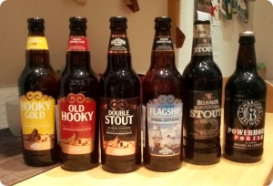
From time to time, having a beer is fun. Sometimes it’s even more fun if you can try different beers in a (more or less) controlled environment and rate them. Such a tasting is best enjoyed if it’s ‘blind’. Otherwise you may get easily diverted by fancy labels and beautiful custom bottles. Not to mention all the nonsense marketing blurb praising the ‘distinct, unique beer’, ‘brewed using only the very best ingredients’.

UK beersWell, we (as a group of five) tried around 20 different beers and rated some basic qualities from color to head to taste. Among them were popular and not-so popular German beers as well as some UK bottles from a specialized shop. Then, I combined all the single scores of each beer in a ‘polar-coordinates’ plot. The grey area denotes the mean of the individual tester’s scores.

flavourmapsNone of us is a professional in describing flavours, but some results are nevertheless intriguing. All the common Pilsner beers (Braustolz, Flens, Schultheiss, Sternburg) obviously lack character, although they definitely have the biggest market share in Germany. The Ales perform better in terms of character, but that doesn’t mean I would drink a particular Ale all the time.

However, we found two notable exceptions to the standard German beers in our survey, the sweet and malty Nerchauer Pumpernickel and the American style Atlantik Ale. Both are coming from smaller-sized breweries, and they might be indicating a trend towards more powerful and courageous brews. Cheers!

Continue reading Sophisticated drinking: How to map a beer

Europe in the ‘right’ direction: Extremism

The European elections are long gone. But a little distance is often useful for an objective analysis of the matter. As discussed in my last post, we could observe a slight shift from centre to right direction in electoral behaviour, but this is not as serious as the dramatic decline of turnout over the years. However, the European parties are literally melting pots of a diverse selection of different parties, loosely grouped by common interests. You can find moderate and extremist national parties being members of the European blocks. The centre-right (christian-democratic) EPP alone counts 72 national parties as its members, among them populist right-wing parties like Fidesz from Hungary.

The extreme right-wing parties are often small and don’t show up in European policy. But how many people actually support them on the national level? This info graphic gives the answer, assembling the percentage of votes for strong right-wing parties in national elections of the last six years.

Votes for right-wing parties

Naturally, maps like these are a simplification: the political profile of each party may be very different. For instance, Italy seems to be a country just on the edge of nationalistic uproar, but the right-wing party included in this data set is actually a coalition and quite moderate compared to others.

Let’s take a closer look on my home country, Germany. Its genuine right-wing party is the NPD, once in a while even conquering a small share in federal and regional elections. It’s a right-wing party from the text book, being so radical it’s more than dubious if they even adhere to the most fundamental ideas of the German constitution. Therefore, in 2001 and 2012 lawsuits were initiated to exclude the party from political activity. The latest one, which is still pending, got much support by an alleged link between the party’s activities and the racist killings of the terror group NSU. This group of only two man and one woman managed to kill 10 turkish or greek people all across Germany from 2001 to 2011, without the authorities even noticing it could be a racist motivation behind.

Since the reunification of Germany in 1990, 152 people lost their live in attacks most likely motivated by right-wing hate and ideology. These maps illustrating all cases are courtesy of ZEIT online, where you can find more resources on each casualty (German only).


Sources: Le Monde diplomatique’s Atlas of globalisation, ZEIT online.

Europe in the ‘right’ direction?

These are thrilling times for news agencies. Many hot topics are dominating the headlines right now, seeking for attention: The turmoil in Iraq, ongoing civil war in Syria, the Ukraine crisis and, of course, the football world championship. Among all these troubling and exciting developments, a very important event is threatened to get lost in the public opinion. Roughly one month ago, the European Parliament was elected by the citizens of the 28 EU member states. Now that the dust has settled the election results will lead to restructuring of the political landscape. For many people (and for me as well), European policy has always been boring, ‘far away’ and of inferior importance.

However, this election is different. Thanks to the Treaty of Lisbon from 2009, some important changes are taking place. Despite the gut feeling of many people that the EU is gaining more and more power, the citizens now have more power themselves to stir EU policy. One important novelty is that the European Parliament is now indirectly able to determine the President of the EU commission, which is the powerful executive branch of the EU and usually proposes new laws. The ongoing debate between the two opponents Martin Schulz (social democrats) and Jean-Claude Juncker (conservatives) on who will be the next commissioner reflects this new situation. However, the candidate is actually proposed by the European Council (the 28 heads of the member states), which is only obliged to take the EU parliament’s preferences into consideration. These are the results of this year’s EU Parliament election compared to 2009.

European Parliament elections 2009, 2014

Continue reading Europe in the ‘right’ direction?

Big Business on Small Islands

It’s been a while, since I last wrote about a subject, and the one I’ll be writing about now is really inconvenient for most of us. But it matters.

It matters because most people have a job and earn money, but are not paid everything listed on their payroll. The reason for that is that your country or state collects taxes to finance the common infrastructure for its inhabitants. There are many different models for collecting taxes, many different ‘goods’ to tax, and even more ways to spend the collected money. In general, authorities collect three different major taxes:

  1. Income taxes. Directly subtracted from your wages.
  2. Corporate taxes. A certain percentage of a company’s net profit.
  3. Value added tax. A tax on sold products. Affects both companies and individuals and depends on the turn-over of goods.

There are many more specific taxes or different ‘flavors’ of the same tax. Here, I visualized the rates of the three major taxes (as listed on wikipedia) using R and the spplot package. I ended up with the following maps. Note that the color key counter-intuitively shows high taxes in blue and low taxes in alarming red, because we want to identify the villainous countries with extraordinary low tax rates.

AllTaxesObviously, Western European countries have similar tax rates and we cannot readily identify tax haven countries. There are some exceptions, though, like the low corporate tax in Portugal and Ireland or low VAT rates in Switzerland. Is this it? Don’t we have more interesting tax refuges to offer in Europe? The answer is not visible in those maps, because size matters.

First, why are low taxes a problem at all? Because, every individual or company who can afford will try to evade tax paying as best as it can. What seems just natural to save money and gain a competitive advantage, is in reality a major burden to our society. Globalized trading and electronic cash flow made it easy to shift huge amounts of money from high tax countries to tax havens—most often tiny states without notable industry or resources. The bottom line is that the high tax country provides all the infrastructure for running a company, while only the tax haven benefits from the company’s profits at no own expenses. And here’s a proper list of European’s tax havens.

Tax_havensSources: wikipedia.org, Deutsche Welle report on tax havens.

# download world shapefile from http://aprsworld.net/gisdata/world/
# import europe map
europe <- readShapeSpatial(fn="europe.simple", IDvar="SP_ID")
# import data
tax <- read.csv("taxes.csv"); tax$Country <- toupper(tax$Country)

# merge data.frames
europe@data <- merge(europe@data, tax, by.x="NAME", by.y="Country", all=TRUE, sort=FALSE)
europe@data <- europe@data[order(as.numeric(as.character(europe@data$SP_ID))), ]

# plot the map
cols <- colorRampPalette(c("#FF4500", "#FFD700", "#89C755", "#4D5773"))(20)
spplot(europe, 9:11,
   xlim=c(2.5e+06, 6.5e+06), ylim=c(1.45e+06, 5.4e+06),
   col.regions=cols,
   as.table=TRUE, col="white", strip=FALSE
)

On weights and vineyards

With only 640 hectare vineyard area, the Saale-Unstrut region in the heart of Germany is one of the smallest wine producing regions in Europe. And it is the most northern ‘official’ wine region in Europe as well, if you ignore a handful of vineyards in Sweden. Wine requires a lot of sun to thrive and a mild climate usually not found so far north, but the Saale-Unstrut region is an exception due to its geological conditions. The steep hills and rocks surrounding the two lazy rivers Saale and Unstrut provide ideal conditions for the grapes: The rocks heat up in summer and slowly release the saved warmth during the night. But this comes at a cost for the wine makers. Automation is only feasible to a very small extent and running these vineyards is mostly manual labor. Which makes it the more interesting for us as tourists and wine testers. So we grabbed our gear and went for a 4 day backpacking tour, mostly along the river Unstrut.

Continue reading On weights and vineyards

A peace-loving nation

Imagine you have 500 Million Euro, what can you buy for that? Well, one of the four big research organizations in Germany, the Helmholtz Association I am working in, spends around 3.8 Billion Euro annually for 18 big ‘national’ institutes.  The Max-Planck-Society spends around 1.5 Billion Euro to finance its research in around 80 smaller institutes.  A full-grown university would cost around 500-1000 Million annually, so you could afford that. A new school building is comparably cheap with only 10-25 Million Euro. For 500 Million, you could get at least twenty, and superb ones too. Or, you buy this:

Global HawkThe Northrop Grumman RQ4 is a rather big, rather expensive unmanned aircraft vehicle (UAV). Some years ago, defence ministry officials decided to adapt this American model instead of developing an own European drone (e.g. by joint company EADS). Since then, this very same amount of money was spent to acquire a single drone with some additional equipment, until the project was cancelled recently. Unfortunately, obtaining the necessary permissions for the European air space was harder than expected. Apart from ranting about this case study of ‘arms acquisition gone wrong’, it is even more interesting to see, what European countries are selling rather than buying. To my knowledge, Germany is one of the biggest arms vendors in the world, yet our official position is that of a nation of peace, reformed by the devastating experiences from two world wars. Thanks to Stockholm based SIPRI institute we can compare the arms exports of European countries:

What you can see is the flow of arms from the originating countries towards the consumers in Europe. The number in the center is the total export volume in Mio US$ to every state in the world, which means, that there are a lot more arms leaving Europe. I omitted that for reasons of simplicity. But this is easy to reproduce.

The data provided by SIPRI is already in a good shape. All you need to do is choose your country of interest, download the spreadsheet file and plot it over a map. To add a little twist to the plot, I used the gplot.arrow() function from package sna, which has a curve argument. When the arrows are plotted in a loop-wise manner, the runif() function provides some random value for curve, making every arrow bent slightly different.

# download world shapefile from http://aprsworld.net/gisdata/world/
# import europe map (subset of the world)
europe <- readShapeSpatial(fn="europe")

# import SIPRI data
dat <- read.csv("Arms.csv")
# add coordinates to table
datc <- merge(dat, europe@data, by.x="Importer",
    by.y="NAME", all.x=TRUE, all.y=FALSE, sort=FALSE)

# plot the map
plot(europe, xlim=c(3e+06, 7e+06), ylim=c(1.3e+06, 5.25e+06),
    border="white", lwd=2, col=grey(0.85))

#plot arrows
origin_x <- europe@data[europe@data$NAME=="FINLAND","x"]
origin_y <- europe@data[europe@data$NAME=="FINLAND","y"]

for(i in 1:nrow(datc)) {
gplot.arrow(origin_x, origin_y, datc[i,"x"], datc[i,"y"],
    length=3e4+2e2*datc$Total[i], angle=50, width=2e4+5e2*datc$Total[i],
col="#FF4500", border="#FF4500", lwd=1, arrowhead=TRUE,
curve=runif(1, -6e4, 6e4), edge.steps=30)
}

plotcircle(mid=c(origin_x, origin_y), r=1.5e5, col="#FF4500", lcol=NA)

From the four countries examined, France and Germany are the bigger arms traders, but they are also the bigger countries. It would be nice to have some more countries, and while we are at it, to learn about the type of arms sold. The SIPRI database contains that information, and I downloaded and compiled a table comprising 15 European countries [Arms_by_type]. Plotted with lattice‘s xyplot() and decorated with a little Inkscape eye candy, it looks like that.

Arms exports by typeFrance’s and Spain’s most requested items are aircrafts and missiles, where Germany’s strength lies more in tanks and sensors (no surprise here). Taken the arms exports of all those 15 countries for 2011-12 together, arms for more than 13.5 Billion US$ were sold, a good part of it to non-European countries. Maybe this share is an issue for the next post.

#load category data
ByType <- read.csv("Arms_by_type.csv")

xyplot(Total ~ Type | Country, data=ByType, origin=-100, type="h",
    pch=16, lwd=10, layout=c(3,5),<ylab="Exports in Mio US$",
scales=list(x=list(rot=45, alternating=FALSE)),
par.settings=list(strip.background=list(col="#FFB90F"))
)

Is Europe threatened by Islamic terrorism?

On April 15, the Boston marathon was target of a terroristic attack. Two students originally from Kazakhstan, Dzokhar and Tamerlan Tsarnaev, placed improvised bombs which detonated during the marathon killing three and injuring several hundred people. In contrast to previous incidents, the two brothers’ attack appears to be the result of a very individual and silent (religious) radicalization, but many questions about the motives remain. However, once more the strong Islamic background seems to play a major role, and this is the bottom-line for the public.

Consequently, a major German news paper called ‘Die Welt’ just issued an article about the role of Islam in Germany accompanied by a poll about the perception of Islam and other religions in Germany. Thirteen thousand people were asked, if, in their opinion, the Islam fits into the western society. This was negated by around 53 %, more than e.g. in Great Britain (46 %) but less than in Spain (65 %). Next, people were asked if they perceive the different religions as enriching or threatening for society:

Copyrigtht by 'Die Welt', 2013. Poll made by Bertelsmann Foundation.
Copyrigtht by ‘Die Welt’, 2013. Poll made by Bertelsmann Foundation. Partly translated in English.

Continue reading Is Europe threatened by Islamic terrorism?